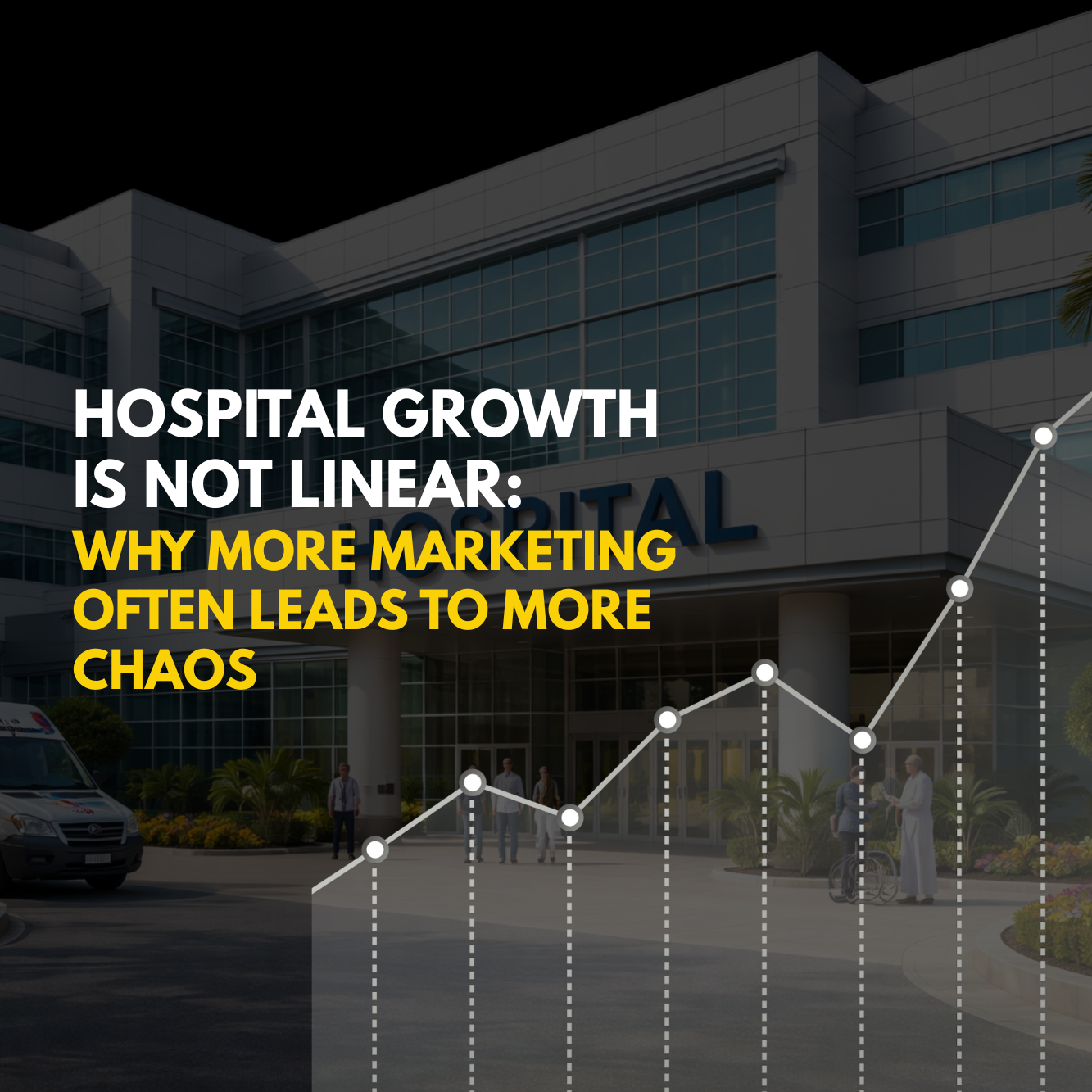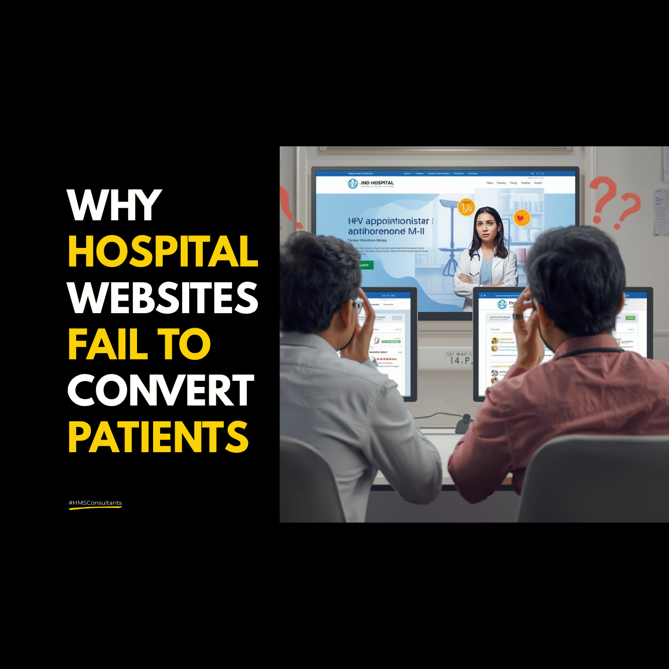
Why Most Hospital Websites Fail Before Patients Ever Click “Book Appointment”
When Traffic Exists but Patients Still Don’t Convert
Many hospitals invest heavily in building or redesigning their websites. The design looks modern, pages load reasonably fast, services are listed, doctors are showcased, and contact details are visible. From the hospital’s perspective, the website appears “complete.”
Yet despite traffic coming in through Google, ads, or referrals, appointment bookings remain inconsistent. Patients visit, browse briefly, and leave. No enquiry. No call. No WhatsApp message. No appointment.
At this point, hospitals often assume the problem lies in marketing, not enough traffic, the wrong audience, or weak promotions. In reality, most hospital websites fail much earlier in the decision journey, long before a patient reaches the “Book Appointment” button.
The Core Misunderstanding About Hospital Websites
Hospitals typically think of their website as a digital brochure. It is expected to display services, infrastructure, credentials, and achievements. While this information is essential, it is not what drives patient action.
Patients do not visit hospital websites to admire design or read institutional descriptions. They visit because they are uncertain, anxious, or seeking clarity. They want reassurance before taking the emotional step of contacting a healthcare provider.
When websites are built to inform rather than guide, patients feel lost instead of supported.
Why Patients Leave Without Taking Action
Patients rarely leave hospital websites because something is missing. More often, they leave because something is unclear.
They are unsure whether the hospital is right for their specific problem. They cannot easily understand what will happen next. They are uncertain about costs, timelines, or whom they will meet. The language feels generic, technical, or institution-centric rather than patient-centric.
This uncertainty does not trigger complaints. It triggers hesitation. And hesitation, in healthcare, almost always leads to exit.
The Emotional Gap Websites Fail to Address
Healthcare decisions are emotional long before they are logical. Fear, doubt, embarrassment, and family pressure shape behaviour far more than credentials or technology.
Most hospital websites speak confidently about services but remain silent about emotions. They explain what is offered but rarely address how patients might feel or what support they will receive.
When websites ignore the emotional context of healthcare decisions, patients do not feel safe enough to proceed. They may intend to return later, but often choose another option that feels more reassuring.
Why “Book Appointment” Is Often Too Early in the Journey
Hospitals place appointment buttons prominently, assuming patients are ready to act. In many cases, they are not.
Patients arrive at hospital websites at different stages of readiness. Some are just researching symptoms. Others are comparing options. Many are trying to understand whether they should even seek treatment now.
When websites push appointments without first resolving doubt, patients feel pressured rather than guided. Instead of clicking, they pause and then leave.
Conversion fails not because the button is poorly placed, but because trust has not yet been earned.
The Information Overload Problem
In an attempt to be thorough, hospital websites often overload visitors with information. Multiple services, long lists of treatments, detailed descriptions, and institutional messaging dominate the pages.
Ironically, more information does not always lead to greater clarity. For patients already anxious, too much technical detail increases cognitive load. Instead of helping them decide, it overwhelms them.
Effective hospital websites simplify complexity. They prioritise relevance over completeness and clarity over volume.
Why Design Alone Cannot Fix Conversion
Hospitals often respond to poor website performance by redesigning the site. Colours change, layouts improve, animations are added, and visuals are refreshed.
While design matters, it cannot compensate for strategic gaps. A visually appealing website that lacks patient journey logic will still underperform. Understanding, not aesthetics drives conversion.
Without aligning website structure to how patients think and decide, redesigns only change appearance not outcomes.
The Missing Link Between Website and Patient Journey
Hospital websites frequently exist in isolation from real patient behaviour. They are built based on internal assumptions rather than observed decision patterns.
Patients move through stages- awareness, concern, comparison, reassurance, and finally action. Websites that do not reflect this progression quickly lose relevance.
When content, navigation, and calls to action are not aligned with these stages, patients feel disconnected. They may trust the hospital clinically, but still hesitate digitally.
Why Website Conversion Is a Marketing Problem, Not a Technical One
Website performance is often handed over to designers or developers, but conversion is fundamentally a healthcare marketing strategy issue.
It requires understanding patient psychology, clear communication, trust signals, and effective expectation setting. It demands alignment between what marketing promises and what the hospital delivers.
Hospitals that treat websites as strategic assets rather than technical projects see significantly better outcomes. Their websites do not just in form they reassure, guide, and prepare patients for the next step.
When Hospital Websites Finally Start Working
Hospitals that address these gaps notice subtle but powerful changes. Bounce rates reduce. Time on site increases. Enquiries feel more relevant. Conversations start with greater clarity. Patients arrive better prepared for consultations.
Most importantly, appointment bookings begin to feel natural rather than forced.
The website stops being a passive presence and becomes an active contributor to hospital growth.
Conclusion: Conversion Fails When Clarity Is Missing
Most hospital websites do not fail because patients are uninterested. They fail because patients are unconvinced.
Before a patient clicks “Book Appointment,” they need reassurance, clarity, and confidence. Without these, no amount of traffic or promotion will produce sustainable results.
Hospitals that want their websites to perform must stop asking how to make patients click faster and start asking how to help patients make confident decisions.
When a hospital website is built around the patient’s real decision journey, conversion stops being a mystery and growth becomes predictable.
is something we strongly believe in, which means ‘Knowledge without application is the same as having no knowledge at all
Akhil Dave
Principle Consultant
Ready to take your Personal Brand to the next level?
Share your details below and we will connect with you to discuss your growth strategy.

Healthcare Digital Marketing Is Not About Social Media
Healthcare digital marketing is no longer only about social media visibility. This blog…
Most Hospitals Still Misunderstand Medical Marketing
Medical marketing is often misunderstood as advertising alone. This blog explains why hospitals…
Why Most Hospital Marketing Looks Exactly the Same
Most hospital marketing today looks almost identical because hospitals often use the same…

Marketing a Clinic Is Different From Marketing a Hospital
Marketing a clinic requires a different strategy from hospital marketing because patients evaluate…
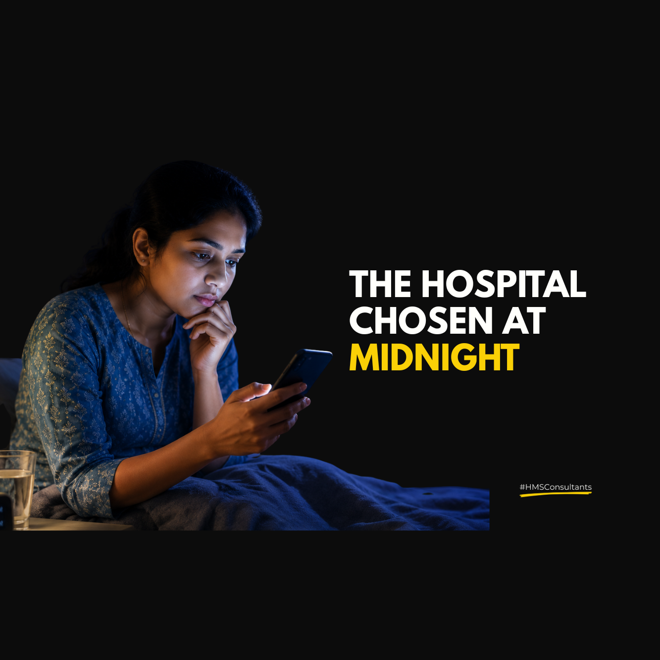
Marketing Ideas for Hospitals That Target the 3AM Patient
Marketing ideas for hospitals in 2026 must go beyond daytime advertising and focus…
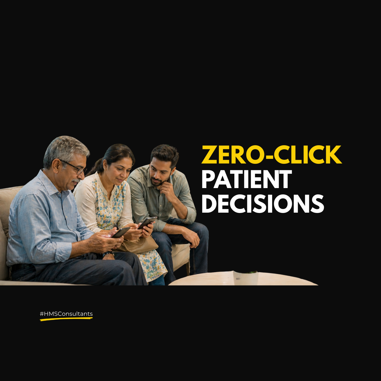
Marketing a Hospital in 2026: The Rise of Zero-Click Patient Decisions
Marketing a hospital in 2026 is shifting beyond websites as patients make zero-click…